Common Mistakes in Choosing Paint Colours
How to Avoid Costly and Disappointing Colour Regrets
Choosing a paint colour should be the most exciting part of a redecorating project. It’s where you get to stamp your personality on your home. Yet for many, it becomes a source of stress and anxiety, often leading to a decision they later regret. A colour that looked perfect in the showroom or on a tiny swatch can look completely wrong on your walls. Avoiding the most common pitfalls is the key to choosing a colour with confidence and achieving a result you’ll love for years to come.
Mistake #1: Trusting the Tiny Paint Chip
This is the single biggest mistake. A 2cm square of colour from the paint display at Bunnings is surrounded by hundreds of other colours and illuminated by harsh fluorescent lighting. It is a completely inaccurate representation of how that colour will look on a large scale in your home's unique lighting. The small size also prevents you from seeing the colour's true "undertones" – the subtle hints of grey, yellow, blue, or pink that can emerge on a larger surface.
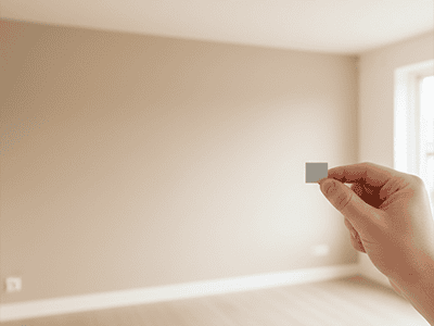
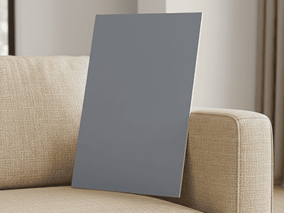
- The Fix: Never, ever choose a colour from the chip alone. Always buy a sample pot and paint a large A3-sized board. This is the only way to see the true colour.
Mistake #2: Ignoring Your Home's Lighting
Light is the most powerful and overlooked element in colour selection. A colour will look completely different in a south-facing room with cool, indirect light compared to a west-facing room that gets blasted with warm, golden afternoon sun. The type of light globes you use at night will also dramatically alter a colour's appearance.
- The Fix: Move your large painted sample board around the room for at least 24 hours. Check it in the morning, at midday, in the late afternoon, and at night under your artificial lights. This is the only way to see how it behaves in all conditions.
Mistake #3: Forgetting About Existing Finishes
You might fall in love with a cool, crisp grey, but if your home has warm, yellow-toned floorboards, cream-coloured kitchen cabinets, and a brown sofa, it's going to clash. Paint doesn't exist in a vacuum; it has to work with all the other fixed and furnished elements in your home.
- The Fix: Before you commit, hold your large painted sample board directly next to your floor, your curtains, your sofa, your kitchen splashback, and your benchtops. This will immediately show you if the undertones in the paint are fighting with the undertones in your existing finishes.
Mistake #4: Playing it Too Safe
After being overwhelmed by choice, many people panic and default to a generic, builder's-grade white for every wall. While white can be beautiful, choosing one without considering undertones can lead to a home that feels sterile, cold, and devoid of personality. A slightly warmer off-white or a very light, subtle greige can provide a much more sophisticated and welcoming backdrop.
- The Fix: If you're nervous about colour, start small. Choose a beautiful, slightly deeper neutral for a feature wall, the inside of a bookshelf, or a powder room. Seeing the positive impact of a well-chosen colour can build your confidence for future projects.
Pro Tip from a Sydney Painter
A professional colour consultation is one of the most valuable services a painter can offer. With a trained eye, we can quickly identify the undertones in your home's fixed elements and understand how the natural light will affect your choices. We can guide you towards a cohesive palette that flows beautifully from room to room. At DRJ Painting, we've helped countless Sydney homeowners navigate the overwhelming world of colour to find the perfect shades that transform their house into a home they truly love.